| |
The title, Agape Book Cafe, became a new signage and logo for the institutional cafeteria. The client needed a new signage for their cafe. It should be adapted with retro design with the fun and uncommon style. The cafe cup could be added for comprehensive imageries for the viewers. The case study developted with various ideas to show the client. The typography choice was very serious for this project as well as the choice of proper colors.
|
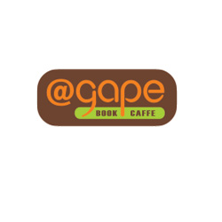
Agape Book Caffe 1
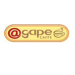
Agape Book Caffe 2

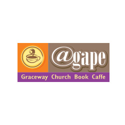
Agape Book Caffe 3
|
|
Agape Book Cafe located to the next Library. So many young people come to the cafe and read the book and use their laptop computer during their leisure. The letter "@" had been adapted by many people who used their laptop computer in here so that it could be fun idea instead using regular "a" for the title.
|
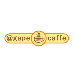
Agape Book Caffe 4
Agape Book Caffe 5
|
Agape Book Cafe 1 was selected as the final one. The clients chosen that one for the young generation's favor by the targeting research. Also it looked simple, and the typo was correct one than any other logo variants.
|
|
| ©2013 Open Seed Proactive Design Studio Inc. All Right Regerved. |

